Project Reflection
Introduction:
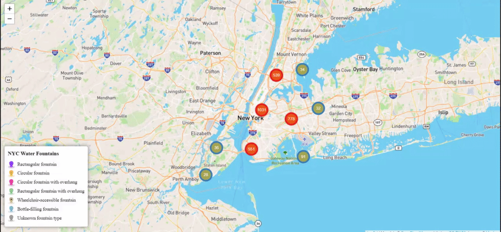
For my final project, I created an interactive data visualization to represent the NYC water fountains. The visualization allows users to explore the location, type, and condition of over 3,000 public water fountains in New York City.
Abstract:
The NYC Water Fountains visualization is an interactive map that provides users with information on the location and type of public water fountains in New York City. The data used in this visualization was obtained from the NYC Open Data and includes information on over 3,000 different water fountains throughout the five boroughs.
Screencap:
Technical documentation:
As previously stated, the data used in the NYC Water Fountains visualization was obtained from the NYC Open Data. The data is in a CSV format, the only cleaning and editing were fixing the longitude and latitude into separate columns and removing unnecessary columns. The front-end of the visualization was built using the Leaflet library for mapping, and the D3.js library for data visualization. The map markers are from IconPro86 with adjusting the colors and creating a “pinwheel” design on one of them.
Artifacts of the Design Process:
Throughout the development of the NYC Water Fountains visualization, I kept a record of my design process, which included sketches and a written prospectus.
Written Prospectus
Using the data set “Cool It!” from NYC Open Data I will be using an exploratory website to showcase the different water fountains around NYC. When first clicking onto the website I would like the “loading page” to be a drop of water going down with a ripple effect. There is a map of New York City with dots to showcase the water fountains in every borough. (Either one map or smaller portions of the map to represent the map whole). Once clicking on the dot there will be cross-referencing data of if it is broken, the position, nearby parks, and filter installation.
Sketch
Reflection:
Throughout the development of the NYC Water Fountains interactive visualization, I had to make several major design decisions. One of the biggest decisions was how to display the data on the map. I ultimately decided to use color coding to indicate the type of fountains with one unified marker, and to have a legend to display what type of water fountain it is.
The most helpful thing I learned from this project was how to work with data in Java, HTML, and CSS. Before this project, I had limited experience with these tools, but I was able to learn a lot through this project. The tutorials were also incredibly helpful, as they provided step-by-step guidance on how to use various libraries and tools. Critiques I received throughout the semester were incredibly helpful in shaping my project. As well as the feedback I received on my rough draft helped me to identify areas where I needed to improve, such as the layout and design of the visualization. This caused me to switch from a .geojson file to map NYC to using leaflet which I have never done before.
My final project differed from my prospectus in several ways. Initially, I had planned to include additional data on the fountains, such as their address and filter installation. However, I ultimately decided to focus on the location, type, and status of the fountains, as this was the most relevant information for users.
One of the major challenges I faced during the development of the NYC Water Fountains visualization was coding the map. The initial map was very unorganized, had lacked depth and user compatibility. In the future, I would look to see multiple different options on how to do something than just one.
If I had more time and resources, there are several things I would change about the NYC Water Fountains visualization. One thing I would add is a feature that allows users to leave reviews or comments on individual fountains. I would also like to add more detailed information on each fountain, such as its history and usage. Finally, I would like to improve the overall design and layout of the visualization to make it more user-friendly and visually appealing.
Read more and explore the code here.